Open Templates in the app and click Customize on either design. The editor puts your settings on one side and a live preview on the other — the preview updates as you type, so you can see the gate the way a visitor will, over a stand-in for your storefront.
![The editor with the Content category open on the Confirm design. The sidebar shows Heading set to Please confirm your age, a rich-text Message reading You must be [age] or older to enter this store, Confirm button and Decline button fields reading I am [age] or older and I am under [age], and a Destination question field reading Where will your order ship?. The preview on the right shows the dark gate card with those words, and the [age] token rendered as 18.](/assets/images/age-verification/editor.png)
The settings sidebar sits at rest as a narrow column of icons. Click one to open that category, and Back to return to the list.
Five categories, the same on both designs except for the second one’s name: Content, If they decline (Confirm) or If they’re too young (Birthdate), Branding, Appearance, and SEO.
Content
| Setting | What it does |
|---|---|
| Heading | The large line at the top. Defaults to “Please confirm your age” on Confirm and “Please enter your date of birth” on Birthdate |
| Message | The paragraph below it. Rich text, so you can bold a word or add a link. Defaults to “You must be [age] or older to enter this store.” |
| Confirm button (Confirm) | Defaults to “I am [age] or older” |
| Decline button (Confirm) | Defaults to “I am under [age]” |
| Date field label (Birthdate) | Defaults to “Date of birth” |
| Submit button (Birthdate) | Defaults to “Enter” |
| If the date is missing or wrong (Birthdate) | Defaults to “Please enter your date of birth.” — a prompt to try again, not a refusal |
| Destination question | Defaults to “Where will your order ship?”. Only asked when a state or province rule applies |
| If the check can’t run | Defaults to “We couldn’t check that just now. Please try again.” |
[age] anywhere in these fields and the app swaps in the
minimum age that applies to the visitor reading it. Type a fixed number and it stops
following your rules — see
Age rules by country and
state.
The two failure messages are not the same thing
They are easy to conflate and they behave differently:
- If the date is missing or wrong is shown when the field is empty or the date cannot be read. The visitor tries again. Nobody is refused for it.
- If the check can’t run is shown when the app itself cannot be reached. The gate stays up and the visitor can retry — nobody is let through, and nobody is turned away.
Neither is the refusal message, which is its own category below.
If they decline / If they’re too young
| Setting | What it does |
|---|---|
| Refusal heading | Defaults to “Sorry — you can’t enter this store” |
| Refusal message | Rich text. Defaults to “You must be [age] or older to shop here. Thanks for stopping by.” |
This is what a visitor sees after pressing the decline button, or after entering a date that works out as too young. It does not close the gate — the store stays behind it.
Worth writing properly. It is the last thing a person who is not your customer reads about your store, and the default is deliberately bland. A line about when they would be welcome, or where else to go, costs nothing.
Branding
| Setting | What it does |
|---|---|
| Show logo | Off by default. Tick it to show the image below |
| Logo | Upload an image. A transparent PNG or an SVG sits best on a colored background |
| Logo width | 60–320px, in steps of 10. Defaults to 140 |
A logo matters more here than on most pages: the gate is the first thing a visitor sees, and an unbranded dark card over a blurred store reads as something wrong with the site rather than as your store asking a question.
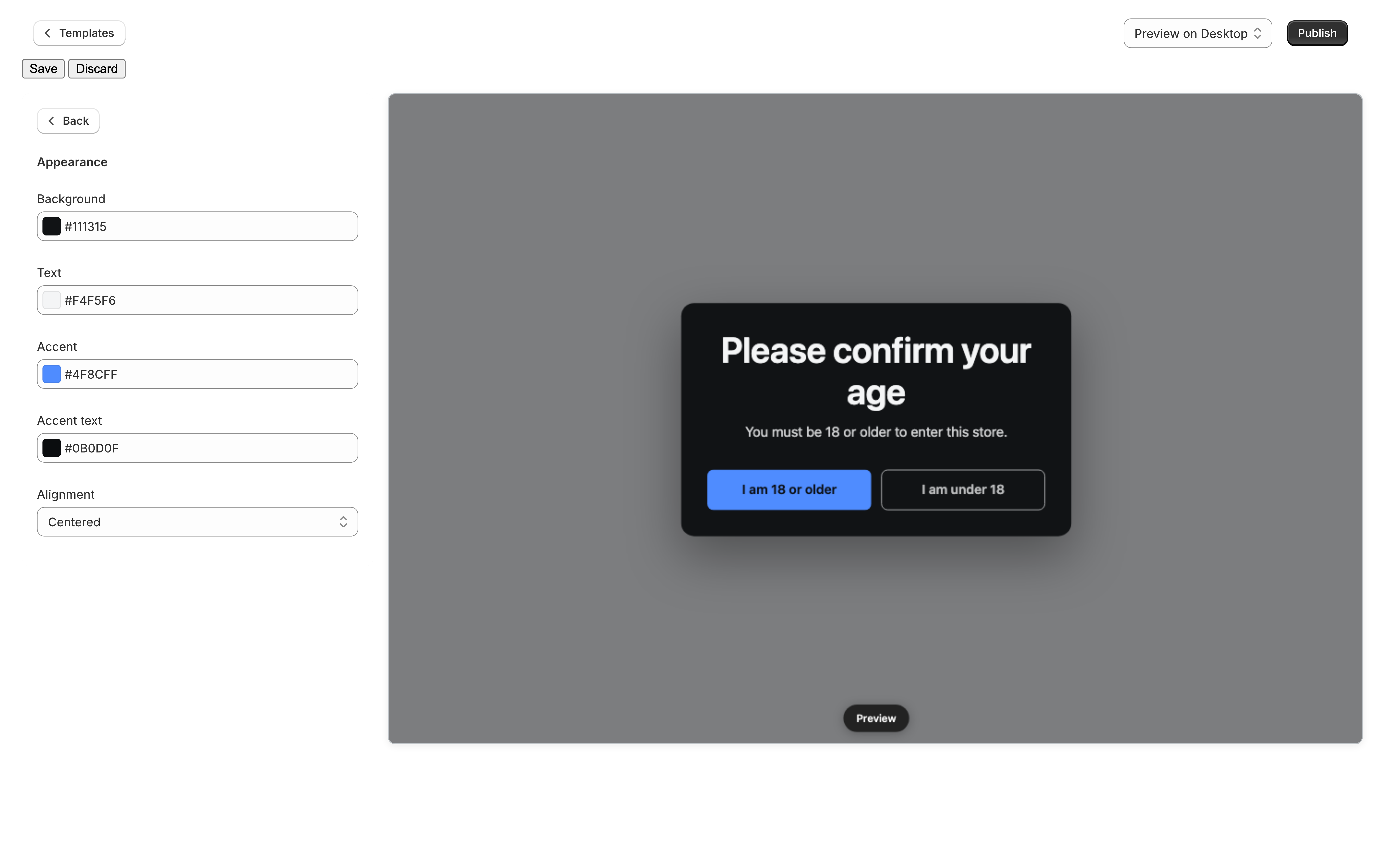
Appearance
| Setting | Controls | Default |
|---|---|---|
| Background | The card, or the full sheet on the fullscreen layout | #111315 — near-black |
| Text | Heading and message | #f4f5f6 — near-white |
| Accent | The buttons | #4f8cff — blue |
| Accent text | Text sitting on the accent color | #0b0d0f |
| Alignment | Centered or left | Centered |
If you switch to a light background, change Text at the same time or the gate will be white on white. On the Centered popup layout the background color is the card; on Fullscreen it is the whole sheet, so a color that looks restrained as a card can be a lot of screen. See How the gate appears.
SEO
Page title defaults to “Age verification”, and it is worth knowing how little it does here. The gate is a layer over your storefront rather than a page that replaces it, so your store keeps its own title in the browser tab. This title is only ever seen by somebody who opens the gate’s own address directly.
Save and Publish
Two buttons, two jobs:
- Save stores your changes to that design. It does not change what visitors see.
- Publish makes that design the one your storefront shows.
You can save as often as you like while you work. Publishing is a separate decision, and you only need it once per design — after that, saving an already-published design updates the live gate.
What is not in the editor
Three things a merchant looks for here and will not find, because they live on your shop rather than on a design — so that changing how the gate looks can never change what it does:
- The ages you enforce — Settings → Age thresholds.
- The layout — Settings → How the gate appears.
- Outage behavior — Settings → In the unlikely event we’re unreachable.
The branding line
On the Free plan your gate carries a small “Powered by Loman Age Verification” line at the bottom. There is no editor setting for it — removing it is what the Standard plan buys, and it is the only difference between the two. See Plans and features.