Open the editor from Templates → Your Templates → Customize.
The screen is in two halves: a settings sidebar on the left, and a live preview of your page on the right. Change a setting and the preview updates in place — no reload, no switching tabs.
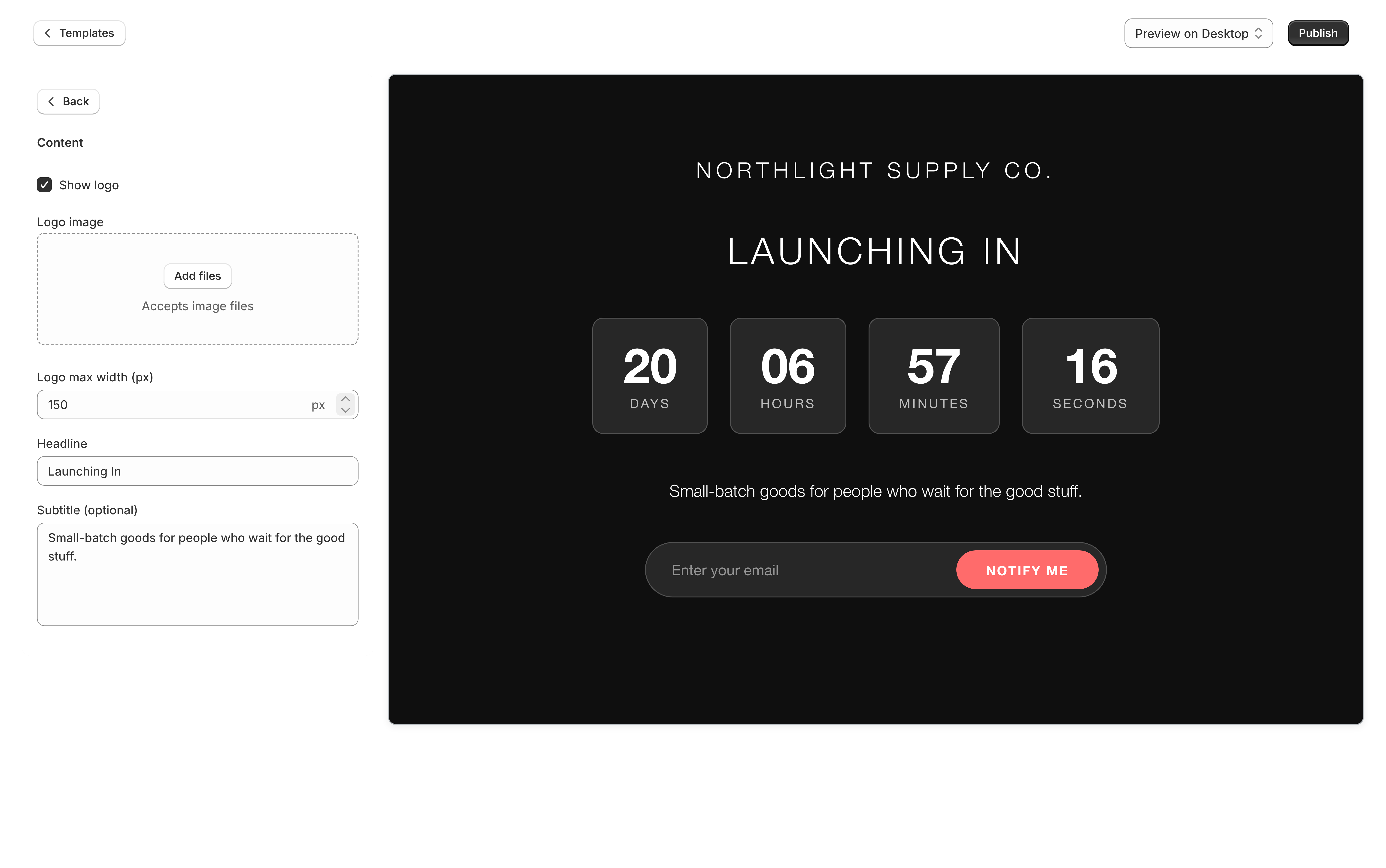
Finding a setting
Settings are grouped into categories — Content, Colors, Typography, Email, Password, Social, SEO & Analytics, and so on. Which categories a template has depends on the template; a video-led design has a Video category, a countdown-led one has Countdown.
The sidebar starts narrow. Hover it to see the category names, click a category to open its settings, and use Back to return to the list.
On a phone there is nothing to hover, so the editor stacks instead: the category names are listed in full across the width of the screen, and the preview sits along the bottom and stays there while you scroll through the settings.
For what each setting does, see the settings reference.
Desktop and mobile preview
The dropdown at the top of the editor switches the preview between Preview on Desktop and Preview on Mobile.
Preview on Desktop always shows you a desktop-width page, shrunk to fit the space it has. On a phone, or in a narrow browser window, the text will be too small to read — what it is there to show you is the layout, such as whether the countdown sits in one row or two.
Every template is responsive, but check both. Background images in particular crop differently, and the Simple template has a separate mobile background image setting for exactly that reason.
Saving vs publishing
These are two different actions, and the difference matters.
| Button | What it does |
|---|---|
| Save | Stores your changes to this template. Visitors see them only if this template is already the published one. |
| Publish | Makes this template the one visitors see, saving any unsaved changes first. |
| Discard | Throws away everything since your last save. |
Changes are not saved automatically. While you have unsaved work, an Unsaved changes banner appears with Save and Discard. Leaving the page with that banner showing loses the changes.
If your subscription is not active, the Publish button is replaced by Subscribe to publish. Saving still works, so you can build the page out and publish once billing is sorted.
Uploading images
Image settings accept a file picker or a drag-and-drop onto the field. Uploads are validated on the way in — an image that is too large or in an unsupported format is rejected with a message rather than silently failing.
Suggested sizes, where the field does not already tell you:
| Setting | Suggested size |
|---|---|
| Logo | No wider than 500px |
| Favicon | 32 × 32 px |
| Background image (desktop) | 1680 × 1050 px |
| Background slider images | 1680 × 1050 px |
| Hero image | At least 1200px on the long edge |
Rich text fields
Page content is a WYSIWYG field: bold, italics, links, lists, and alignment from a small toolbar. It is the right place for a paragraph of copy under your heading.
It is not a layout tool. If you want to change where things sit on the page rather than what they say, that is either a different template or custom CSS.
Checking your work on the storefront
The preview is accurate, but it is still a preview. To see the real thing, open:
https://your-store.myshopify.com/apps/coming-soon
That serves your published template exactly as a visitor gets it, whether or not the page is currently switched on.